I’ve never joined a photo pool party. But, you may recall, one of my resolutions for 2009 is “improve my photography skills”.
So when erin at house at hill road invited folks along on her yellow week, I jumped in.
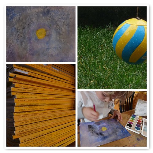
Yellow has never been a favorite color of mine. I don’t own a single piece of yellow clothing–I look terrible in it. So I was surprised, when I walked around our house hunting for yellow, to discover it everywhere.

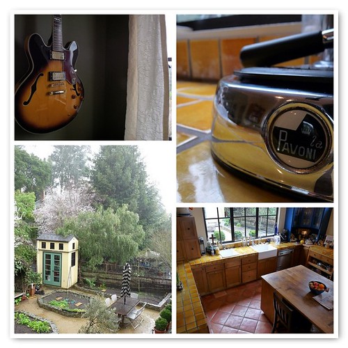
Almost every room in our house has yellow or gold as an accent color–it seems we use it the way some people use red. And it isn’t just in the background. We put a big hug of honey-colored tile in our kitchen; the entire exterior of our house is stuccoed in yellow. It’s a great foil for foliage.

So maybe I like yellow more than I realized. There’s nothing like it for adding a little sunlight. (But I’m still not gonna wear it.)
I have a lot to learn about photography, but jumping in the pool has been fun. Thanks for inviting us for a dip, Erin!

This activity you did is fun to examine closely. Your eye for composition, color and content or subject matter is very good. I especially like the angle-of-view in many of the photos. Those photos are most dynamic.
(My comments come from my film background.) Editors of film or video have to be aware of “match editing” between scenes or locations. Since you have made a photo montage, I’d like to point out the differences I’ve noticed in lighting between the groupings of your photos.
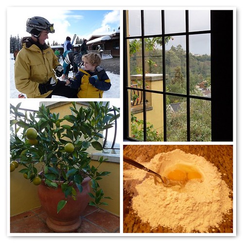
When outdoor light is diffuse, it can wash away your subject. It helps to crop the part that looks washed away out, as you did with the lemon tree. Diffuse or bright light rarely matches indoor lighting–so one usually needs a flash or an additional source of lighting for indoor shots to match the two.
You can see this in the 4-some with the guitar. The 3 indoor photos look great together. The 4th, your adorable shed, is a great angle and interesting subject, and that photo could stand alone, but the diffuse outdoor light at the top of the photo doesn’t match the color saturation or lighting of the indoor photos.
The following foursome with the egg works, even though the lighting in the egg shot is very different than the bright light of the 3 outdoor photos. In this foursome, the color saturation of all 4 works together. The repeated use of black lines in all four photos and yellow also unifies them. The black in the photo of your Charming Husband and son’s coats and the darkness of the lodge adds a strong line element, which compliments the black lines of the window–then there is a touch of black in the railing behind the lemon tree. The simple black line of the spoon looks so delicate.
Thanks for sharing.
Wow, Kristin, you really did examine my photos! If I’d realized anyone would be looking so closely, I might have spent more time putting together the mosaics!
I agree that the photo of the potting shed doesn’t quite fit in with the other three. I just slapped it in there because I like it. That photo definitely was washed out–quite literally. If you click on it and examine it up close, you can see that raindrops make up the first layer of the photo.
It’s interesting and constructive to get feedback from someone who knows what she’s talking about. I do have a lot to learn. Thanks! Now I’m off to your blog to offer some feedback on your writing style.
Just kidding. 😉
I’m sorry. I should keep my big mouth shut. I like to examine photos though and I thought that was part of the exercise, but I didn’t refer to the other site you mentioned to see the specifics.
You have a wonderful eye for photography as evident by your blog and I wouldn’t say that if I didn’t think it true.
But I’ve been thinking a lot about color saturation and lighting in photographs because I’ve noticed in people’s blogs that there isn’t always a consistency between the indoor and outdoor lighting which seems to effect the look as a whole in the blog.
In my own blog I fear I may run into problems using photographs with lots of light in them because the very first photo I used in my header is so dark and subdued. I keep selecting images that match the color saturation and lighting so it all looks like it goes together. I get stuck on visual details like that when it sounds like I should probably be focusing more on my writing style.
Anyway, I will most certainly benefit from hearing your comments. Please leave a few.
I have a huge crush on yellow these days, so am loving yellow week – your photos especially!
Aw, thanks, Melissa.
Kristin, please don’t keep your mouth shut! The conversation here is what makes blogging worth the trouble. I’m sorry I teased you with the snarky comment about offering feedback on your writing style. I only tease my nearest and dearest, you know. I didn’t mean to imply that your writing style is lacking–it’s quite clear and strong, I think! It’s just that if I *were* to leave feedback on a blog, it would have to be related to writing. I have a little more expertise there than I do with photography.
Yellow Week is just a fun opportunity for folks to make a group photo pool on Flickr, based on a similar theme–in this case the color yellow. The pool is a nice mix of people who dabble in photography like I do, and people who have a lot of talent.
http://www.flickr.com/groups/994874@N24/
Kristin, you might want to check it out to see how some of the more professional folks deal with color saturation and lighting on their blogs. If you find some photos you like, you can click on the photographer’s profile, and oftentimes there will be a link to a blog.
And hey, what happened to your blog? None of the links to it work anymore!
You did a wonderful job seeking out yellow. Does it make you long for spring? I need an excuse to further my photography skills but I always seem to come in late in the game with knowledge about fun exercises like this. Guess I could do it on my own!
I love how something that anyone might have in their home, like a stack of National Geographics, suddenly becomes interesting in a photograph. I particularly like the wet tetherball and Mr. T’s sun. Oh, and the flour and egg is wonderful You inspired us to try yellow photos, too. Clementine took 185 photos. Three cheers for digital cameras!
Susan, 185 photos?! Wow! I love that your girls joined in on the fun.
If the rest of you haven’t been to Susan’s site to see their yellow photos, you must:
http://homeschoolinginthekitchen.blogspot.com/2009/02/studies-in-yellow.html
It’s lovely to see how they’re juxtaposed.
And thanks, Gina, for the kind words. Even if Bon Jovi did get all the yellow love. 😉
I couldn’t really even pretend to analyze the composition of any of those photos because I think I have fallen in love with your kitchen counters!!!! Are they really yellow tile? They look fantastic! And, for the record, I have absolutely never complimented anyone on their kitchen countertops before!
Great resolution! Great photos! Hope there’s more to come!
Hi Lynnie,
It’s nice to hear from you again!
I love my kitchen counters too. They are yellow–or a gold shade of yellow. When we lived in Portland, my husband worked for a fabulous tile company, and we fell hard for these French tiles. They’re terra cotta, which is painted white, and then glazed in the most gorgeous, translucent, variegated colors. This shade is called miel, which is French for honey, and it really does look like honey. We knew it was kind of crazy to tile our counters in gold–what with the gold and avocado green appliances of the 70’s not so far behind us–but we both liked it so much that we took a chance. It’s been eleven years since we built the house and I love it still.
Thanks for the compliments on the photos. I’ve been having fun with my camera this year!
I love your backyard! My eyes are missing some green these days (and yellow) I love your pictures too; I’m just a novice myself. But I did get the book Nikon D40 for Dummies… 🙂
Thanks for stopping by, Jessica! Things are definitely greening up here in California–I have my garden work cut out for me this weekend. If it doesn’t rain…
And thanks for the kind words about the photos–I am definitely a novice myself!